Leading vs. Lagging: The Distinction That Matters
A lagging indicator counts outcomes after the fact: excursions that occurred, shipments that arrived late, product written off. It tells you how you did. A leading indicator tracks the conditions that produce those outcomes, while there is still time to act on them. It tells you what is about to happen.
Both have a place. Lagging indicators are how you keep score and prove performance to an auditor. But a program built only on lagging metrics can only ever react, because by the time the number moves, the loss is already booked. The predictive value lives in the leading indicators, and most dashboards are thin on exactly those.
The KPIs Worth Tracking
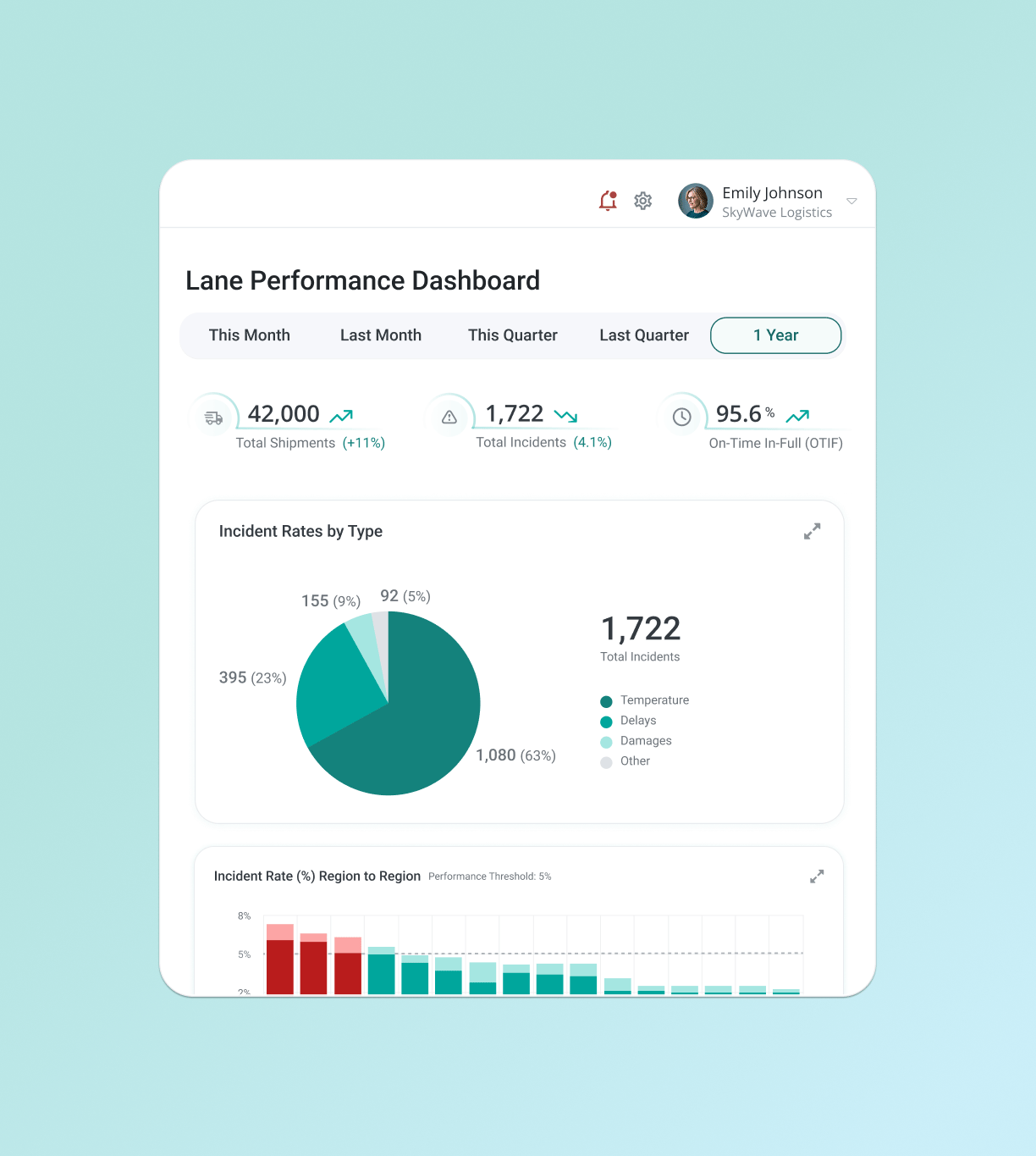
A handful of metrics do most of the predictive work. Track these across every lane, not just in aggregate, because a network average hides the specific lane that's drifting.
-
Lane excursion rate: The share of shipments on a given lane that experience a genuine temperature excursion. Tracked per lane over time, a rising rate is one of the clearest early signals that a route is degrading.
-
Time out of range: How long shipments spend outside their limits, as a distribution, not a pass/fail count. A lane whose shipments increasingly cluster near the edge of tolerance is warning you before any of them cross it.
-
Dwell-time variance: How much the time spent at transfer points swings from shipment to shipment. Rising variance at a hub, more than the average itself, signals an unstable handoff where the next long hold is forming.
-
On-time-in-full (OTIF): Deliveries that arrive complete and on schedule. Beyond a service metric, a slipping OTIF on a specific lane often precedes temperature trouble, because delays and excursions share the same root causes.
-
Carrier and handler performance drift: The trend in a specific partner's reliability on a specific lane. The trend line matters more than the current value: a good carrier sliding is a risk building.
-
Mean kinetic temperature (MKT) trend: For lanes carrying cumulative thermal stress, the direction of MKT over successive shipments shows whether conditions are quietly worsening.
The Vanity Metrics to Demote
Some widely reported numbers feel like performance and predict almost nothing. Most are worth keeping in a monthly report; the fix is to move the leading metric that sees failure coming into the seat the vanity number holds today.
-
Total shipment volume, swapped for per-lane excursion rate: Volume measures activity. The share of shipments going wrong on each specific lane measures where the risk actually sits.
-
A single network-wide excursion percentage, swapped for the per-lane distribution behind it: One blended number averages away the handful of lanes that need attention. The spread across lanes is where the signal lives.
-
Raw alert count, swapped for the true-event rate once false positives are filtered: A count that mixes genuine excursions with sensor noise tracks the noise as much as the cold chain. Separating real events from false alarms turns the same feed into a usable trend.
The original numbers still have a place. They describe the past in aggregate, which is exactly where risk hides, so they belong in the report rather than at the center of a program trying to see failure coming.
Read Trends and Lanes, Not Snapshots
A KPI's predictive power lives in two dimensions the average destroys: time and lane. A single month's excursion rate is a snapshot. The same rate climbing over six months on one route is a forecast. The value comes from watching each metric move, on each lane, so a degrading route stands out from a stable network long before it fails. A dashboard that only shows this quarter's totals has thrown away the trend that would have warned you.
Reading a trend means knowing what counts as movement. Set a baseline for each lane from its own normal range, then watch for a shift that holds across several shipments. One late delivery or one wide excursion is noise. The same metric drifting the same direction over consecutive shipments is the signal worth acting on.
Turn the Metric Into a Decision
A leading indicator earns its place only if something happens when it moves. Each one needs a warning sign to watch, a threshold that trips a review, a standing response, and a named owner, so a rising number becomes an action instead of a line in a report. The table below is a starting template; the exact thresholds belong to each team's own risk tolerance.
| KPI |
Warning sign |
What trips the trigger |
Typical response |
Owner |
| Lane excursion rate |
Rate climbing over consecutive shipments on one lane |
Crosses the lane's agreed ceiling, or roughly doubles off baseline |
Reassess the lane; review packaging and routing |
Quality / lane owner |
| Time out of range |
Shipments clustering nearer the tolerance edge |
Distribution shifts toward the limit across several shipments |
Tighten packaging or pre-conditioning; add monitoring |
Quality / packaging |
| Dwell-time variance |
Swings widening at a transfer point |
Variance at a hub exceeds its normal band |
Investigate the handoff; brief or change the handler |
Logistics / lane owner |
| On-time-in-full (OTIF) |
Slipping on a specific lane |
Falls below the lane's service threshold |
Find the delay cause before it turns thermal |
Logistics |
| Carrier / handler drift |
A reliable partner's trend sliding |
Trend breaches the agreed floor |
Requalify or escalate with the partner |
Procurement / quality |
| MKT trend |
MKT rising over successive shipments |
Direction stays up across a review window |
Reassess cumulative thermal exposure on the lane |
Quality |
A metric that climbs on a chart while nobody acts is a more sophisticated way of documenting a loss.
What This Looks Like on One Lane
Take a single air lane that has run clean for a year. In month one, on-time-in-full slips a few points, nothing alarming on its own. In month two, dwell-time variance at the transit hub widens, as shipments start waiting longer and less predictably for the same connection. By month three, time out of range creeps up: shipments still pass, but more of them finish near the edge of tolerance instead of comfortably inside it. None of these is an excursion. Each is a leading indicator moving the same direction.
A program watching only lagging counts sees nothing yet, because nothing has failed. A program watching the leading signals per lane sees three of them drift on one route at once, which is the pattern that runs ahead of a loss. The lane gets reassessed, the handoff at the hub gets investigated, the packaging spec gets revisited, and the reroute happens before the first excursion rather than after it. Same data, caught a quarter earlier, while it was still a decision instead of a write-off.

How Validaide Turns KPIs Into Foresight
Validaide's Performance Intelligence is built on this idea: measure the leading signals across every lane and feed them into a forward-looking risk view.
The Dynamic Pharma Index draws on real shipment performance and incident history alongside temperature exposure, packaging, supplier quality, security, and route complexity, so the metrics that predict failure feed the score directly, per lane, across more than 60,000 assessed routes. Because the score updates continuously, a lane whose excursion rate, dwell-time variance, or carrier performance is drifting sees its risk rise, and the lane is flagged for attention before the trend becomes an excursion. The dashboard stops reporting what went wrong and starts pointing at what's about to.
References